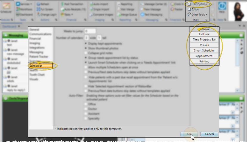
Scheduler User Options
Use the Scheduler tab of your User Options window to set up how your Scheduler looks and behaves. Your security rights must include full access to the User Options Editor setting in the Practice Administration security group for this feature to work for you.
Assign Settings Tool - These settings are specific to you, and will follow you on whatever computer you log into: Other operators may have different settings. If another operator has the settings you want to use, that operator can use the Assign Options tool to copy those settings to you, or vice-versa.
Open the User Options window from the File, Home, Patient, or Scheduler ribbon bar. Then choose the Scheduler tab at the left side of the window. You can then use the tabs at the right of the window to choose the type of settings to work with.
Choose the General tab at the right of the Scheduler User Options window to set up navigational and certain visual options for your schedule.
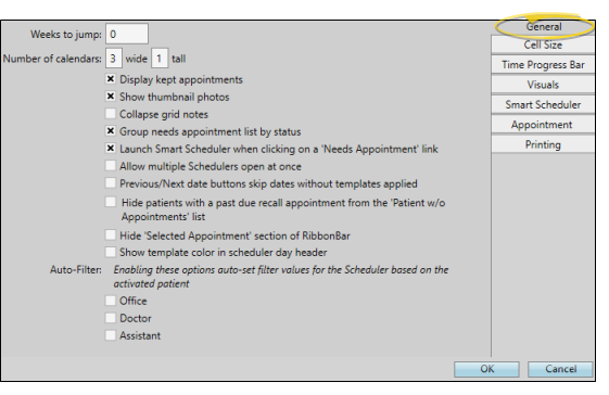
Weeks to Jump - The Weeks to Jump setting is your default number of weeks to jump ahead in your schedule, generally the average amount of time between adjustment visits.  Jump Day /
  Jump Week is on e jump after today.
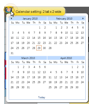
Number of Calendars - Choose how many navigation calendars to display in your Scheduler.
Display Kept Appointments - Appointments that have been processed as Kept can appear dimmed on your schedule, or can be removed from your schedule entirely. If the appointments appear on the schedule, you can hover over them to view the details and open the patient folder, just as you can with currently scheduled appointments. In addition, the amount of doctor time assigned to that appointment remains visible on your Scheduler
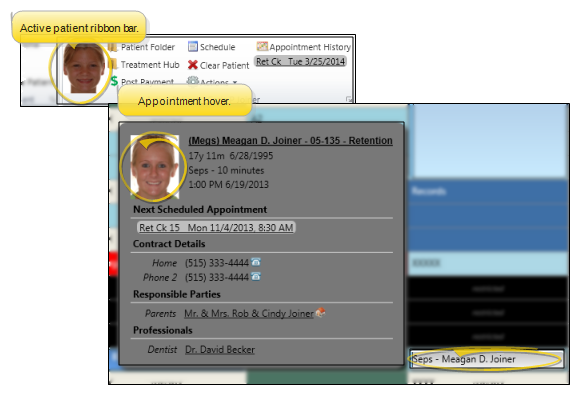
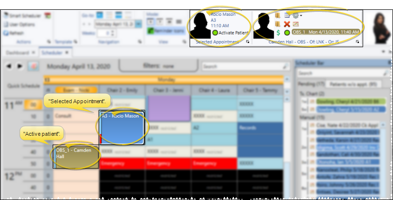
Show Thumbnail Photo - Enable this option to include a thumbnail of your defaut image type when you hover over a scheduled appointment cell or activate a patient in the Scheduler. This serves as a nice visual reminder and helps prevent mistakes. However, disabling this feature may improve Scheduler responsiveness on some slower computers.
Collapse Grid Notes - Enable the Collapse Grid Notes user option to collapse notes you have typed into your scheduler into a tooltip. If this option is disabled, the notes will always appear under the day of the week header. See "Scheduler Notes" for details.
Group Needs Appointment List by Status - Enable the Group Needs Appointment by Status user option to group patients in the Patients Without Appointments list by status, or disable the option to display the list alphabetically by patient last name. grouping by status may be disabled automatically when the list includes more than 150 patients, to prevent undue system slow-downs. See "Needs Appointment List" for details.
Launch Smart Scheduler From a "Needs Appointment" Link - Enable / disable the Launch Smart Scheduler setting in your Scheduler User Options to choose whether to open the Smart Scheduler for a patient when you click on a Needs Appointment link in the Patient Information Panel of a patient folder, or whether clicking the link opens the Scheduler date with the patient activated. This feature works only for patients on the Pending section of the Needs Appointment list. When you click the link for patients on the Patients Without Appointments section, the Scheduler opens, but the Smart Scheduler is not launched. See "Needs Appointment List" for detailsabout each section of the list.
Allow Multiple Schedulers Open at Once - Enable this option if you want to be able to open multiple sessions of the Scheduler within a single instance of Edge Cloud. In other words, each time you click the  Scheduler icon from your ribbon bar, a new Scheduler tab will be opened within your Edge Cloud system. Your front desk might use this option, for example, to keep today's schedule open on one Scheduler tab, while rescheduling patient appointments on another Scheduler tab.
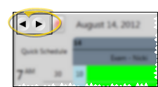
Previous / Next Date Buttons Skip - Enable this option if you want to skip dates that have no scheduling template assigned to them when you use the Previous / Next Date buttons in your Scheduler. This option also takes the current filter values into account. For example, clicking the next button will advance the Scheduler to the next day that not only has a template applied but also a template that has chairs that meet the current filter values. Also note that you can always use the Scheduler calendar to access a specific date, whether or not that date has a template applied.
Hide Patients With Past Due Recall from the Patients w/o Appointments List - Enable / disable the Hide Patients with Past Due Recall user option to prevent / allow patients with overdue recall appointments on the Patients Without Appointments tab of your Needs Appointment list.
Hide Selected Appointment Section of Ribbon Bar - Enable / disable the Hide Selected Appointment Section of Ribbon Bar option to omit / include the section of the Scheduler ribbon bar that shows which appointment your cursor is currently on. This may or may not be the same as the "Active" Scheduler patient.
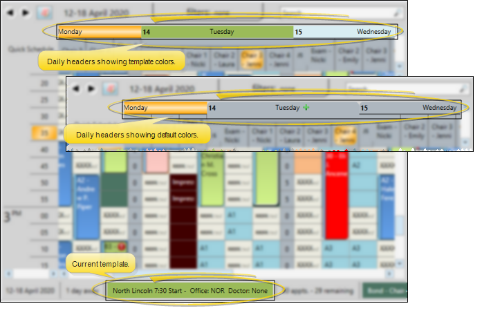
Show Template Color in Scheduler Day Header - Enable the Show Template Color in Scheduler Day Header user option to use the Scheduler template color as the day's header color in your Scheduler. This feature is especially useful when you are use Week View, or viewing multiple scheduling dates simultaneously. If this option is disabled the header will use the default color from your Visual User Options > Color Scheme. Whether or not you show the template color in the Scheduler header, the current template name and color will appear in the Scheduler status bar.
Auto-Filter - You can automatically filter the Scheduler's displayed appointments, based on the currently active patient, by enabling one or more category in the General user options window: Office, Doctor,
By default, Edge Cloud will stretch or squeeze the Scheduler cells to best fit your screen. However, you can use the Cell Size tab of your Scheduler user options to define cell minimum and maximum widths, as well as cell heights, to display things just the way you like them.
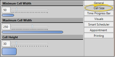
Minimum Cell Width - Set the narrowest size of your grid columns: The bigger the number, the wider each cell will be.
Maximum Cell Width - Set the widest size of your grid columns: The bigger the number, the wider each cell can be.
Cell Height - Set the height of your grid rows: The bigger the number, the taller each cell will be.
The time progress bar overlays a horizontal stripe (or bar) across your scheduling grid to indicate the current time on today’s schedule. This lets you see at a glance who is running late and who will be coming in soon. The bar can be enabled/disabled, and its width, opacity, and color can all be edited in the Time Progress Bar tab of your Scheduler user options.
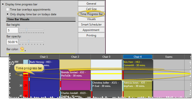
Display Time Progress Bar - Enable / disable the bar entirely with this setting.
Time Progress Bar Overlays Appointments - Enable this setting to place the bar on top of patient appointments. Disable the feature to "dim" the bar as it goes through cells that contain scheduled appointments. In the example at the top of this topic, this setting is disabled.
Only Display Time Progress Bar on Today's Date - Enable this setting to display the bar only on today's schedule. Otherwise, the bar will appear at the current time, no matter what date you are viewing.
Bar Height - Set the height of the bar: The bigger the number, the thicker the bar.
Bar Opacity - Set how "see-through" the bar is. A value of "1" means the bar is solid and nothing can be seen "behind" it. A value of "0" means the bar is transparent and you will not be able to see the bar at all.
Bar Color - Set the color of the bar. Choose a bright color if you want to emphasize the bar. Choose a lighter color if you want the bar to be a more subtle reminder of how the day is going.
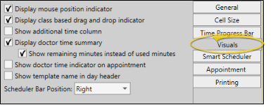
Use the Visuals options to set up many viewing choices that define how your scheduling window looks and behaves.
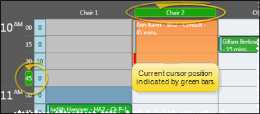
Display Mouse Position Indicator - As you move your cursor around the appointment cells, the Scheduler can highlight your current row and column position along the edges of your schedule, helping you pinpoint your cursor location.
Display Class Based Drag & Drop Indicator - Enable the Use Class Based Drag and Drop Indicator option of your Scheduler user options to highlight the grid cells that match the procedure classification of the appointment you are dragging to a new location. Grid cells that do not match the procedure's classification will be dimmed. If you disable the setting, no cells will appear dimmed when you drag and drop appointments.
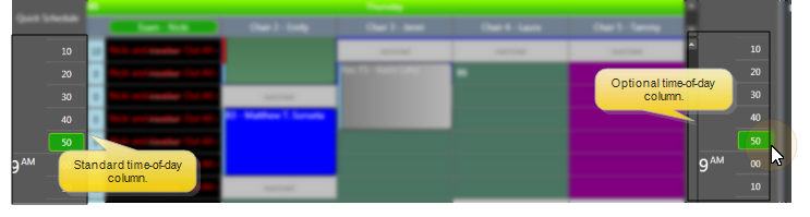
Show Additional Time Column - Enable this option to display the time-of-day column on both the left and right edges of your schedule. Otherwise, the time column displays on the left only.
Doctor Time Settings - Your schedule can show you how many minutes of doctor time is scheduled for each time slot, and exactly where that time is located. This feature is controlled by several settings. More...
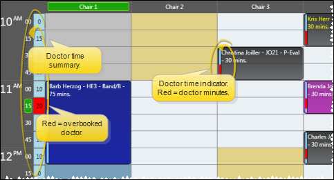
Display Doctor Time Summary - You may include a narrow column at the left edge of each day's schedule that indicates either the amount of doctor time currently scheduled, or the amount of doctor time available to be scheduled in all columns for that time slot. When multiple orthodontists have appointments scheduled on a single grid, you will see a doctor time column for each orthodontist.
Show Remaining Minutes Instead of Used Minutes - If you have enabled the Display Doctor Time Summary option described above, you may enable this option to show the number of minutes still available to schedule for the doctor in the summary column. If this option is disabled, the columns will show the number of doctor time minutes that have already been scheduled.
Show Doctor Time Indicator on Appointment - If you enabled the Display Doctor Time Summary option described above, you can also choose to include a colored bar beside each appointment that indicates exactly which minutes throughout the time slot require the orthodontist.
If your General Scheduler User Options have enabled the Display Kept Appointments feature, and your Scheduler Visuals User Options have enabled the Display Doctor Time Summary feature, the doctor time remains on your schedule even after appointments have been processed as Kept..
Show Template Name in Day Header - Enable this option to display the template name in the header for each day on the Scheduler.
Scheduler Bar Position - Select where you want your Scheduler bar displayed on your scheduling screens.
Use the Smart Scheduler user options to set up many choices that define how your Smart Scheduler works for you, including how many available appointments to list in your search window, using Doctor Time scheduling, and applying default doctor, office, and assistant filters. These settings are defaults only: You can enable / disable these features while using the Smart Scheduler
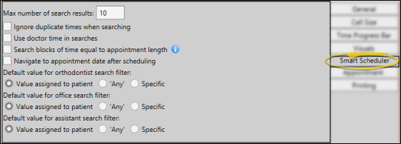
Maximum Number of Search Results - Select the number of available appointment openings to include in your search list. If you cannot find an appropriate appointment time from that list, you can make this number larger, or change your Search Details to expand your search results.
Ignore Duplicate Times When Searching - Enable the Ignore Duplicate Times option to list an available appointment time only once, regardless of the number of chairs you have open at that time. If this feature is disabled, the Smart Scheduler will list each chair that is available as a separate appointment.
Use Doctor Time in Searches - Choose whether you want the Smart Scheduler to calculate doctor time already scheduled for other chairs when selecting available appointment openings. If this feature is enabled, the Smart Scheduler will ignore chairs that look available, but would cause doctor time to be overbooked for that time interval. If this feature is disabled, doctor time is ignored as the Smart Scheduler searches for open appointment times.
Search Blocks of Time Equal to Appointment Length - When this option is enabled, your Smart Scheduler search results will be set apart at least by the length of the appointment being searched for. For example, if you have a block of appointment slots free from 9am - 11am, and you are searching for a half-hour appointment, enabling this option will produce search results for 9am, 9:30am, 10:00am, 10:30am, and 11:00am. However, if this option is disabled, your search will include results for each available time slot (i.e. for a scheduling template with a 10-minute increment, you would get results for 9:00am, 9:10am, 9:20am, 9:30am, etc.)
Navigate to Appointment Date after Scheduling - Enable this option to open the Scheduler to the appointment date after you appoint a patient with theSmart Scheduler.
Default Orthodonist, Office, Assistant Search Filter - Select which orthodontist, office, and assistant to use as the default filter: Choose "Value Assigned to Patient" to use the patient's assigned doctor, office, and/or assistant as the default search filter; select "Any" to default to including all doctors, offices, and/or assistants in the search; select Specific to select an individual orthodontist, office, and / or assistant to be the default when you initialize the Smart Scheduler.
Use the Appointment tab of your Scheduler User Options to set up notification details, and how appointments will look after they have been scheduled.
Hide Needs Appointment in Hover - Enable this option to omit the next appointment details from the tool tip that appears when you hover over the patient's appointment in your Scheduler. Note that this also omits the Needs Appointment tool tip alert for patients assigned to a status that requires an appointment scheduled in the future.
Consolidate Notification Icons - Special icons appear on your patients' appointments to notify you of certain situations and events.
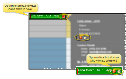
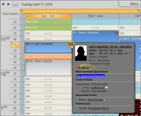
Show Notification of Medical Alert - You can choose to show a  Medical Alert icon on Scheduler appointments. When this option is enabled, you can hover over the icon to open the patient information pop-up window, where you can read the alert message.
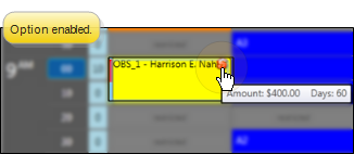
Show Notification of Past Due Account / Past Due Threshold - You can optionally include a 
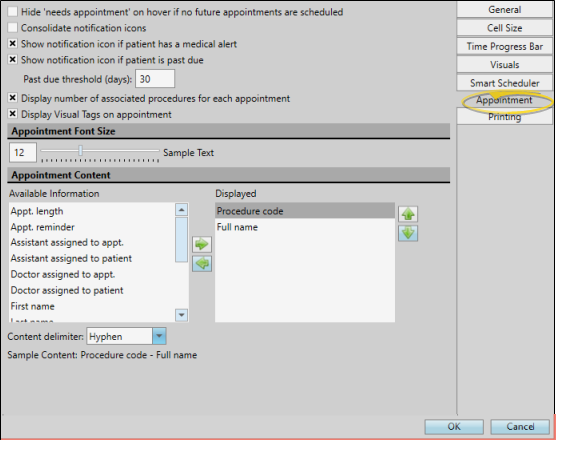
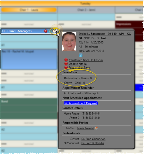
Display Number of Associated Procedures for Each Appointment - You can choose to show / hide the number of dental procedures (i.e. " " that are associated with a scheduled appointment. When this option is enabled, you can hover over the number to open the patient information pop-up window, where you can see the procedure descriptions. (See "Dental Procedures Editor" for details about setting up your list.)
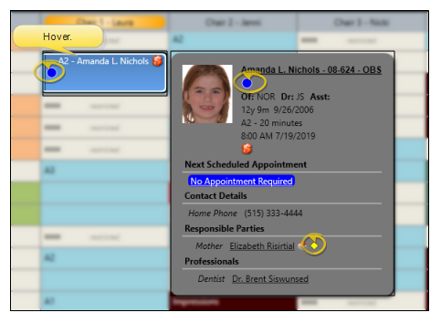
Display Visual Tags on appointment - You can choose to show / hide the patient's visual tags on the patient's scheduled appointment. Regardless of this setting, the visual tag will always appear in the appointment hover and in your Smart Scheduler. See "Visual Tags" for details.
Appointment Font Size - Use the slider bar to set the size of text to use in your Scheduler.
Appointment Content / Delimiter - Use the left / right arrows to add and remove the information you want to display in your scheduled appointment cells. You can use the up / down arrows to re-order the items. Also, select a content delimiter, such as a hyphen, to separate each type of information.
Regardless of what you display in appointment cells, information such as the doctor, office, and assistant assigned to both the patient and the appointment, are always available when you hover over the appointment in your Scheduler.
If you choose to show linked procedure abbreviations in your appointment cells, be aware that any procedures that do not fit on the cell will be truncated.
Use the Printing section of your Scheduler User Options to select the protocol for printing your schedule in graphical format.
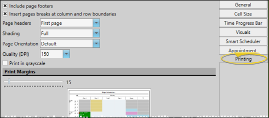
Include Page Footers - Enable this option to include the date and time the schedule was printed at the bottom of the page.
Insert Page Breaks at Column and Row Boundaries - Enable this option to force page breaks only at full rows and columns. If this option is disabled, the schedule will print to the page margins, possibly splitting the last row and/or column of the page onto the next page.
Page Headers - Select which page, or pages, you want your header to print on. The header includes the report title and the date of the schedule you're printing.
Shading - Select whether to use color throughout the entire schedule, only for scheduled appointments, or none. Choosing less than Full shading will use less ink.
Page Orientation - Select which paper orientation to use for printing: your default printer orientation, portrait (up-and-down), or landscape (sideways).
Quality (DPI) - Select the quality of the printing. The higher the quality, the more ink you will use. Note that you can only print up to the DPI supported by your printer.
Print in Grayscale - Enable this option to print the report in black and white, rather than full color.
Print Margins - Use the slider to set the left / right margins of the report.
Print Your Schedule - While in the Scheduler, you can print your schedule with the settings you selected above. Use the  Print icon from your Quick Access toolbar to print a graphical copy of the currently displayed schedule. See "Printing from Edge Cloud" for details. If you prefer, you can also print a variety of non-graphical Appointment Day Sheet reports.
You can click another